Map How Things Connect
Spreadsheets are holding you back. They can help you understand what you've got but don't do a good job of showing you how it's all related. Exaptive tools allow you to map out how things connect - evolving and refining your understanding of your topic in the process.
Build a starting view
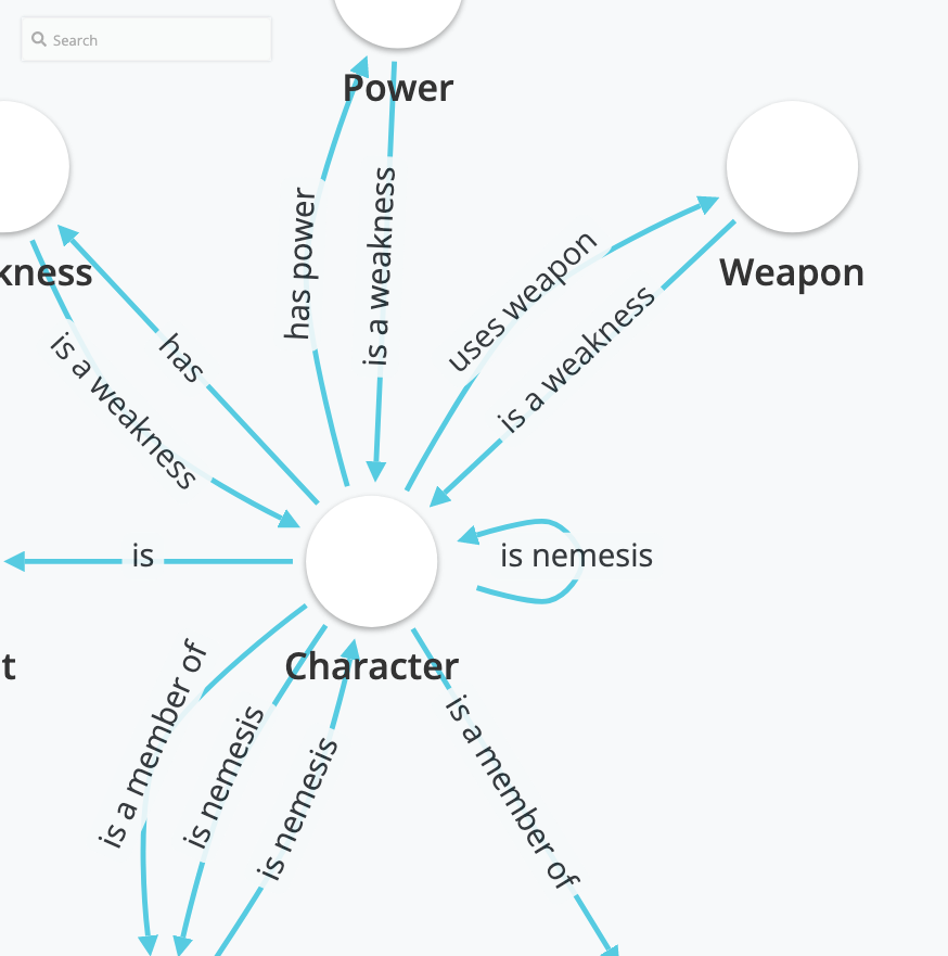
The first step to building network visualizations is to setup a schema, a map of how the pieces of your data are connected to each other. Easily add elements and their relationships to each other using a form/query driven interface that asks you how your elements are interconnected.
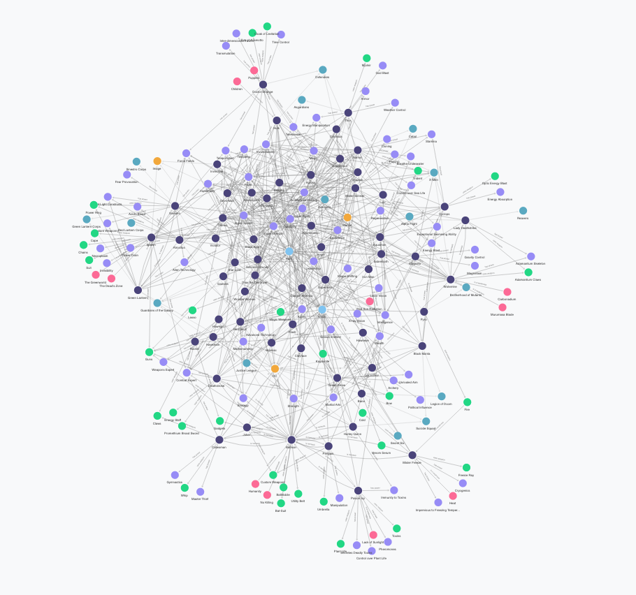
Once your schema is set, upload data to see the obvious and non-obvious connections it contains.
Add nuance and style
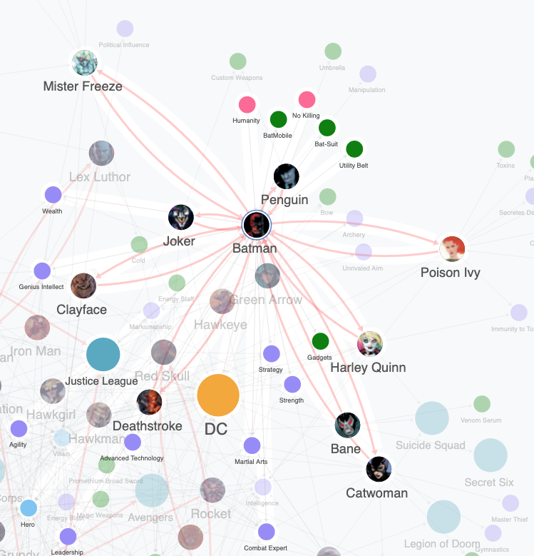
A network of nodes with similar size and color can be hard to parse. Make some nodes larger, give more weight to certain connections, change their background color or shape, have different label sizes or upload an image background. Using the style panel you can customize nearly every aspect of the network view.
Share with others
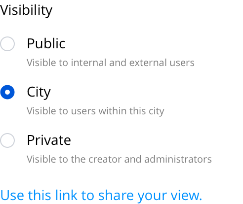
You have built an interesting and enlightening network view of a particular problem, now what? You can share your work with the outside world or invite others to view it in the confines of your studio or city.
The examples on this page are from a city based on comic book characters but you can see real world examples at the links below:
It's easy to get started
Sign up and begin your risk-free, 30-day trial. Not ready to sign up? Set up a personalized demo with one of our experts to see how the Exaptive ecosystem can help you connect the dots.