I’m an algorithms guy. I love exploring data sets, building cool models, and finding interesting patterns that are hidden in that data. Once I have a model, then of course I want a great interactive, visual way to communicate it to anyone that will listen. When it comes to interactive visuals there is nothing better than JavaScript’s D3. It’s smooth and beautiful.
But like I said, I’m an algorithms guy. Those machine learning models I’ve tuned are in Python and R. And I don’t want to spend all my time trying to glue them together with web code that I don't understand very well and I’m not terribly interested in.
I managed to create an interactive data application, thought, that was the keystone of a post about building topic models on the presidential State of the Union addresses. This "xap" relies primarily on three open source technologies: HTML web inputs, Python to build the machine learning model, and JavaScript D3 for the visuals. Plus, the visuals communicate with one another such that hovering over one of the lines in the D3 line plot will dynamically create another D3 word cloud of the most important terms that describe that topic. I didn't have to write any glue code.
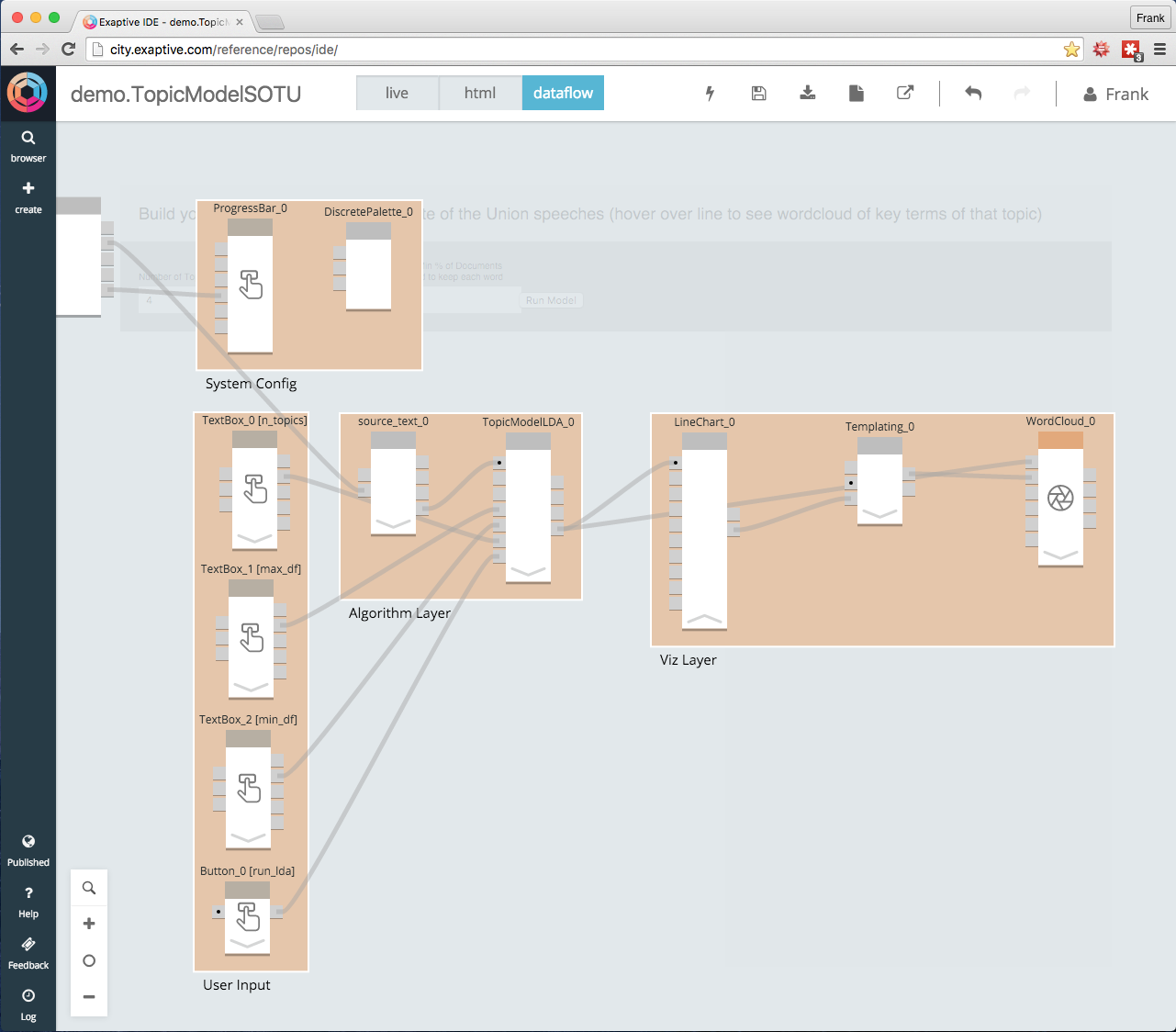
Here is a behind the curtain look at the Exaptive elements that make up this xap:

The xap is grouped into those same 3 functional areas - user input (HTML), algorithm (Python), and visualization(D3.js), plus a fourth to show a progress bar when the app is processing a model and control a universal color scheme across plots. Each section is made up of several components. Each component takes inputs on the left and outputs to the right. Which outputs are connected to which inputs is governed by a drag and drop wire. Inside each component, the best technology to accomplish that task is encapsulated. The platform takes care of communications between components.
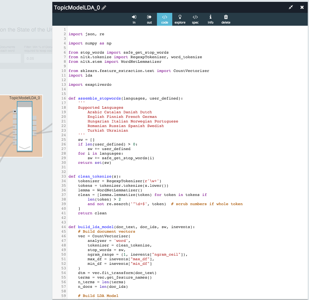
Clicking on the component in the algorithmic layer shows the Python code used to build the Latent Dirichlet Allocation Topic Model.

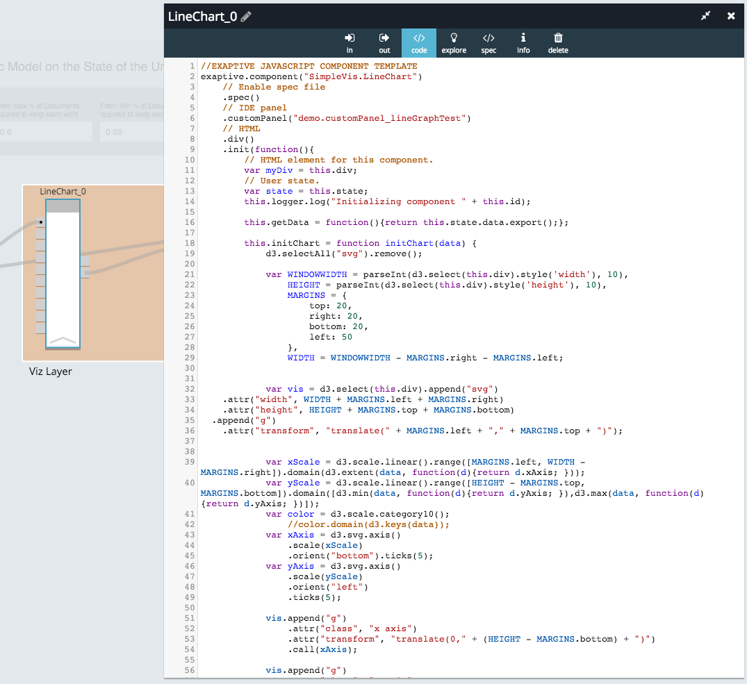
This is the part I wrote. The output is being fed to some JavaScript in the visualization layer that uses D3:

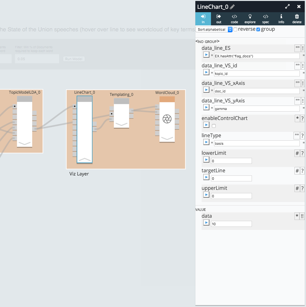
This is the part I did not write. In fact, this is far better and more scalable D3 than I can write. All I have to do now is connect the output data of my topic model component to the inputs of the visualization components. Not only that, but the output of one visualization can be used as an input into another one to make the plots dynamic and interactive.

The same applies to the User Input components. They use JavaScript to dynamically create the HTML inputs that let a user run their own topic model. I didn’t write those either. I just dragged them in from the standard toolbox. Even though they are different technologies, with no glue code I wired them together in just a few minutes, and they can supply the inputs for my Python topic model component.
I’m an algorithms guy (please stop me if I start repeating myself), and what I want more than anything else is to be able to effectively communicate the models I’ve built and get them into the hands of other people to see what they can find. But somewhere out there is someone who is a great visualization person that would love to have good algorithmic components to wire into their visuals. They make my work better, and I hope my algorithms can do the same for them. If I can effectively connect and collaborate with those interested in visualization, design, user experience, subject matter expertise, and even other types of algorithms, then we can amplify the quality of each other’s work.
Comments