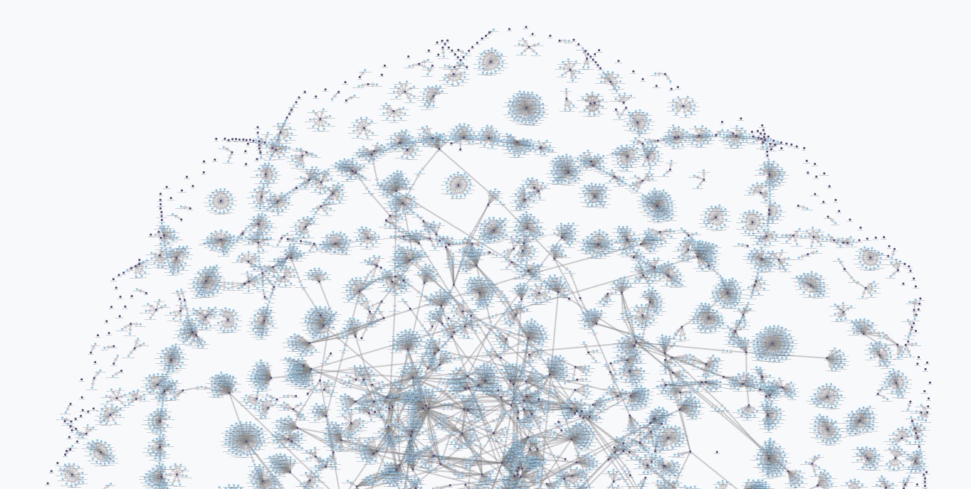
At the beginning of the year we posited that those of us who work with complex data need to move away from rows and columns and move towards graphs when thinking and working with our data. The first step is creating your model. This step is critical, and unfortunately, in my opinion, it is the least fun, mostly because this step is hard. We'd like to immediately be able to create cool network diagrams and query the data to find unique and innovative match-ups, but starting with the model is often the most non-intuitive, and over-looked step. So, while I want to jump into creating mind-blowing data visualizations, we are going to spend a bit more time with models and data entry. We want to ensure that you get the value in being able to generalize the problem you are mapping out.
Read More »Blog
I recently moved from Boston to Oklahoma City. My wife got offered a tenure-track position at the University of Oklahoma, which was too good an opportunity for her career for us to pass up. Prior to the move, I had done a lot of traveling in the US, but almost exclusively on the coasts, so I didn't know what living in the southern Midwest would bring, and I was a bit trepidatious. It has turned out to be a fantastic move. There is a thriving high-tech startup culture here. I've been able to hire some great talent out of the University, and we're now planning to build up a big Exaptive home office here. Even more important, I was delighted to find a state that was extremely focused on fostering creativity and innovation. In fact, the World Creativity Forum is being hosted here this week, and I was asked to give a talk about innovation. As I thought about what I wanted to say, I found myself thinking about . . . cowboys.
Read More »Innovation Management: The Value of Seeing What You Have
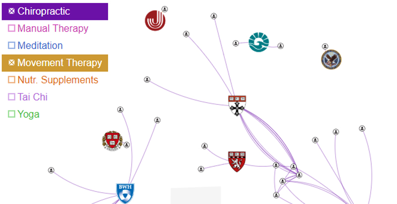
If your job is to get your company, team, or community to innovate, you know how organizational forces can make it hard to even try something new. Visualizing the resources available is an effective first step in overcoming some of those organizational forces. Simply being able to see, and show, what you have allows you to make a compelling case for marshaling resources and even spark some initial interactions in that direction.
Read More »How Data Visualization Supports the Formation of Better Hypotheses
Since Exaptive launched in 2011, we’ve worked with many researchers, particularly in medicine and the natural sciences. PubMed®, a medical journal database, pops up repeatedly as a key tool for these researchers to develop hypotheses. It’s a tool built in a search-and-find paradigm with which we’re all familiar. Execute a keyword search. Get a list of results. Visualization can make search - and, therefore, research - much more meaningful.
Read More »Machine Learning Helps Humans Perform Text Analysis
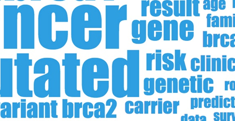
The rise of Big Data created the need for data applications to be able to consume data residing in disparate databases, of wildly differing schema. The traditional approach to performing analytics on this sort of data has been to warehouse it; to move all the data into one place under a common schema so it can be analyzed.
Read More »Moving Beyond Data Visualization to Data Applications
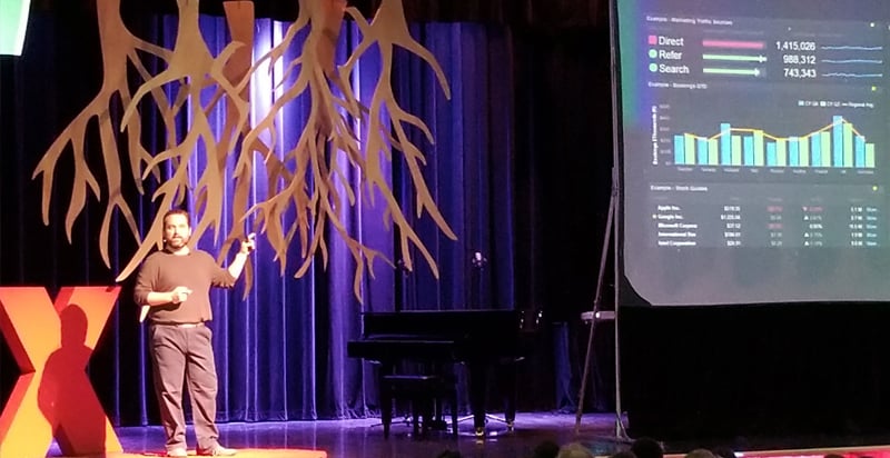
One thing we love doing at Exaptive – aside from creating tools that facilitate innovation – is hiring intelligent, creative, and compassionate people to fill our ranks. Frank Evans is one of our data scientists. He was invited to present at the TEDxOU event on January 26, 2018.
Read More »A Graph-Analytics Data Application Using a Supercomputer!
We recently had to prototype a data application over a supercomputer tuned for graph analysis. We built a proof-of-concept leveraging multiple APIs, Cray’s Urika-GX and Graph Engine (CGE), and a handful of programming languages in less than a week.
Read More »A Data Exploration Journey with Cars and Parallel Coordinates
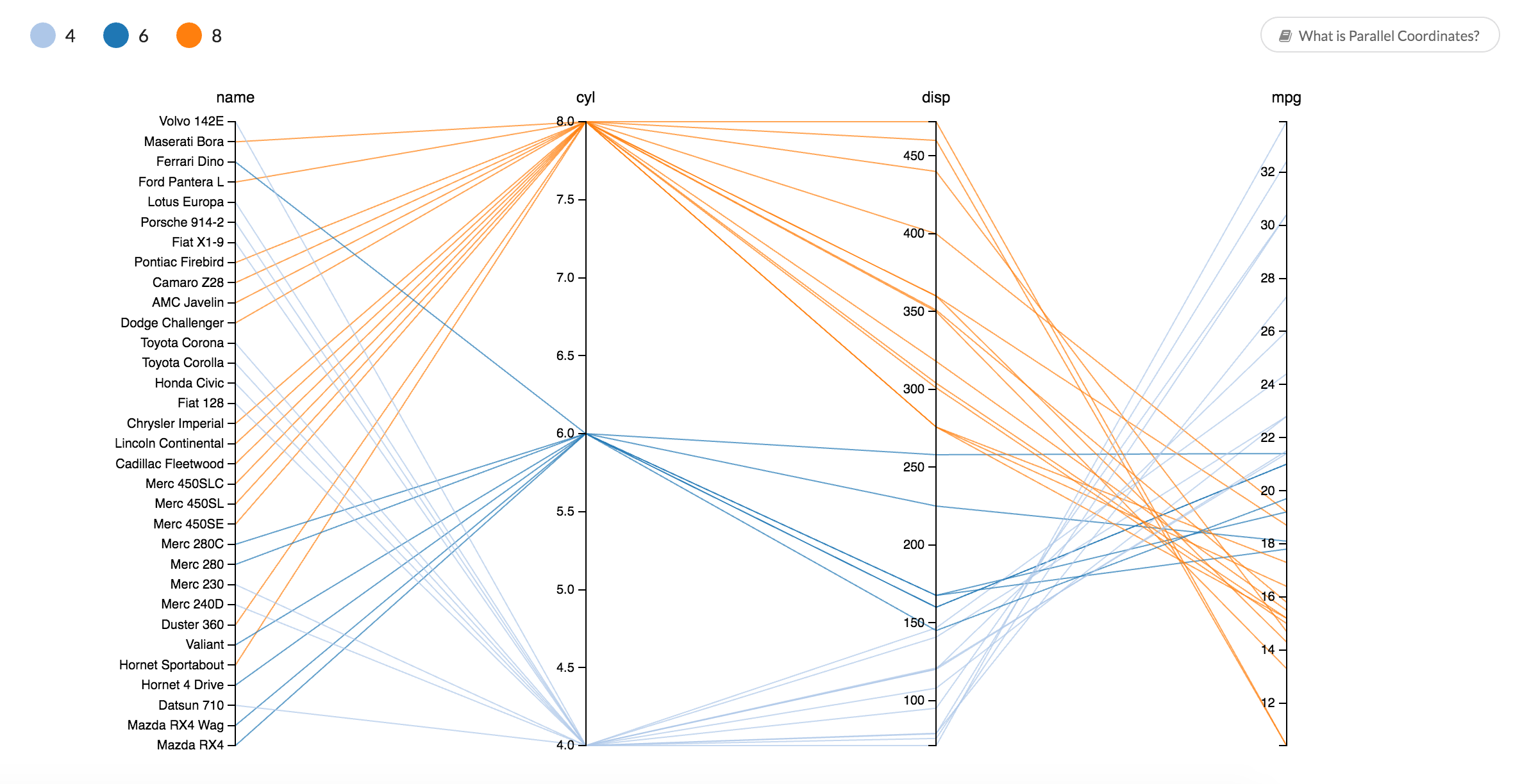
Parallel coordinates is one way to visually compare many variables at once and to see the correlations between them. Each variable is given a vertical axis, and the axes are placed parallel to each other. A line representing a particular sample is drawn between the axes, indicating how the sample compares across the variables.
Read More »Finding Netflix's Hidden Trove of Original Content with a Basic Network Diagram
Nexflix has collected an impressive amount of data on Hollywood entertainment, made possible by tracking the viewing habits of its more-than 90 million members. In 2013, Netflix took an educated guess based on that data to stream its own original series, risking its reputation and finances in the process. When people were subscribing to Netflix to watch a trove of television series and movies created by well-established networks and studios, why create original content? Now, few would question the move.
Read More »When Earth is Like an Egg: 3D Terrain Visualization
Some of the most satisfying breakthroughs happen when technology gets used in a way it was never intended. While working with our graphic design group at Sasaki on ways to generate a dot pattern for a decorative screen, we came across some open-source software called StippleGen. Stippling is a way of creating an image by means of dots. StippleGen was created to optimize stippling for, among other things, egg painting. The software does a great job of laying out dots with greater density on the darker areas of the image while keeping a comfortable spacing between the dots. What's more, the voronoi algorithm it uses gives an irregular, organic pattern. The ah-ha moment came when I realized this could be applied to a different problem, visualizing terrain; specifically, optimizing terrain meshes in 3D software based off elevation data (a.k.a. Digital Elevation Model (DEM)).
Recent Posts
Posts by Author
- AIBS BioScience Talks (1)
- Alanna Riederer (1)
- Austin Schwinn (2)
- Clive Higgins (3)
- Dave King (7)
- Derek Grape (2)
- Dr. Alicia Knoedler (2)
- Frank D. Evans (4)
- Jeff Johnston (1)
- Jill Macchiaverna (9)
- Josh Southerland (1)
- Ken Goulding (1)
- Luke Tucker (3)
- Matt Coatney (3)
- Matthew Schroyer (4)
- Mike Perez (10)
- Sandeep Sikka (1)
- Shannan Callies (2)
- Stephen Arra (1)
- Terri Gilbert (2)
- Tom Lambert (2)
Posts by Tag
- Innovation (19)
- collaboration (19)
- team building (17)
- Data Applications (15)
- Data Science (14)
- collaborate (13)
- new idea (13)
- Data Visualization (12)
- cognitive city (11)
- cognitive network (11)
- teambuilding (11)
- discovery (10)
- thought leadership (10)
- Exaptation (9)
- research (9)
- technology (8)
- Data Exploration (7)
- Platforms (7)
- Data + Creativity (6)
- Text Analysis (6)
- open data (6)
- software (6)
- tech (6)
- Big Data (5)
- Network Analysis (5)
- conference (5)
- ethnographics (5)
- human-computer interaction (5)
- innovation software (5)
- network diagrams (5)
- Communicating About Data (4)
- Dataflow Programming (4)
- Design (4)
- HCI (4)
- Platform (4)
- Rapid Application Development (4)
- artifact (4)
- co-production (4)
- innovation management software (4)
- startup (4)
- use case (4)
- women in tech (4)
- attribute (3)
- entrepreneurship (3)
- ethnographic (3)
- ethnography (3)
- Abstraction (2)
- Data-driven Decision Making (2)
- Machine Learning (2)
- PubMed® Explorer (2)
- User Interface (2)
- algorithm (2)
- entrepreneur (2)
- 3d Visualization (1)
- Financial (1)
- Netflix (1)
- building models (1)
- hackathon (1)
- hairballs (1)
- interdisciplinary (1)
- knowledge graph (1)
