I am constantly amazed by the energy and momentum around data science. Only a few years ago, I would be met with a blank stare when I told someone I planned on going to grad school for machine learning. Today, there is no need for my “it's like computer science, linear algebra, and statistics had a combined love child” analogy as most people instantly respond with “Oh, like AI!”
Read More »Blog
Modern Research: Faster Is Different
Faster is different. It sounds strange at first because we expect faster to be better. We expect faster to be more. If we can analyze data faster, we can analyze more data. If we can network faster, we can network with more people. Faster is more, which is better, but more is different.
Read More »Machine Learning Helps Humans Perform Text Analysis
The rise of Big Data created the need for data applications to be able to consume data residing in disparate databases, of wildly differing schema. The traditional approach to performing analytics on this sort of data has been to warehouse it; to move all the data into one place under a common schema so it can be analyzed.
Read More »Moving Beyond Data Visualization to Data Applications
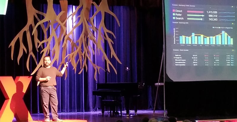
One thing we love doing at Exaptive – aside from creating tools that facilitate innovation – is hiring intelligent, creative, and compassionate people to fill our ranks. Frank Evans is one of our data scientists. He was invited to present at the TEDxOU event on January 26, 2018.
Read More »Exploring Tech Stocks: A Data Application Versus Data Visualization
A crucial aspect that sets a data application apart from an ordinary visualization is interactivity. In an application, visualizations can interact with each other. For example, clicking on a point in a scatterplot may send corresponding data to a table. In an application, visualizations are also enhanced with simple filtering tools, e.g. selections in a list can update results shown a heat map.
Read More »A Data Exploration Journey with Cars and Parallel Coordinates
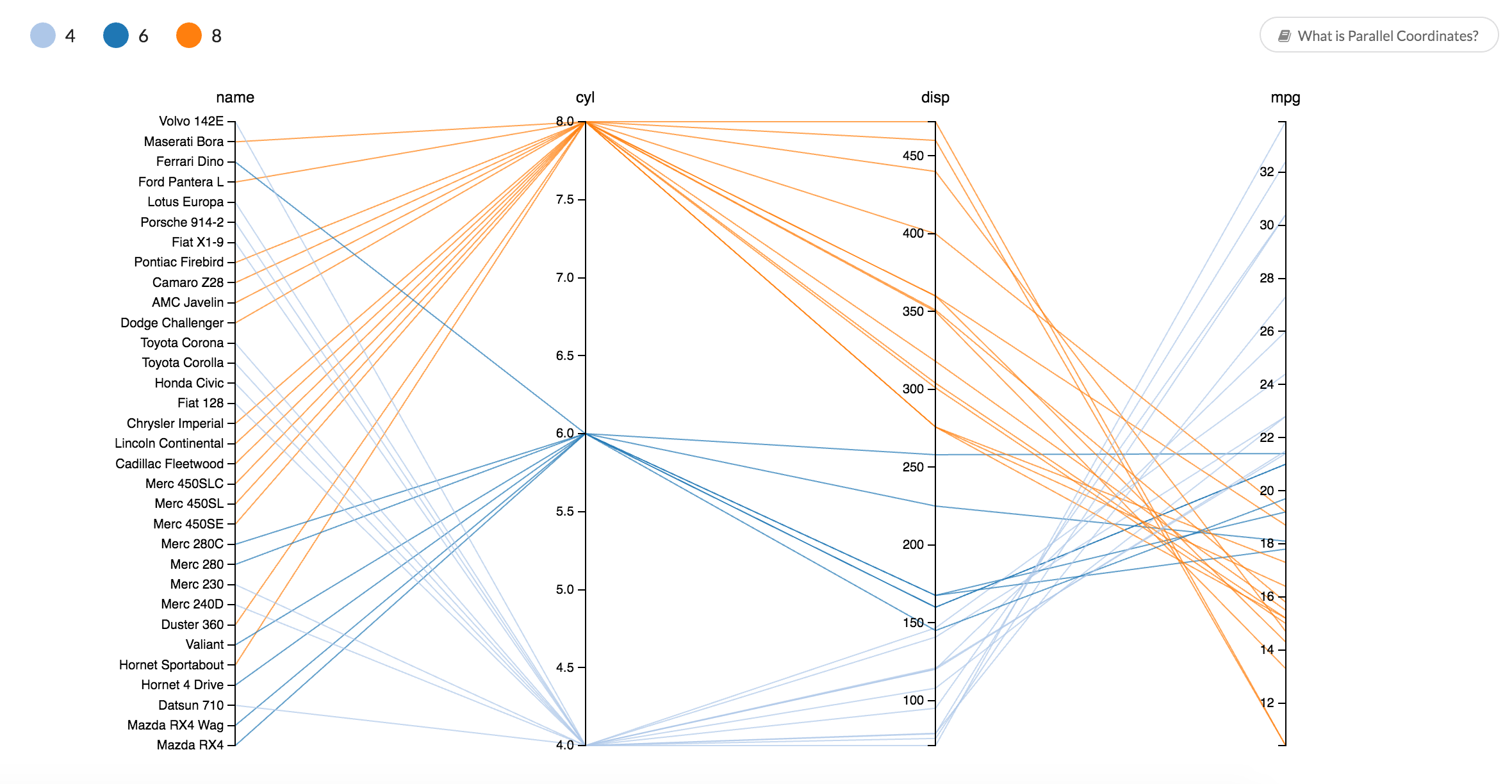
Parallel coordinates is one way to visually compare many variables at once and to see the correlations between them. Each variable is given a vertical axis, and the axes are placed parallel to each other. A line representing a particular sample is drawn between the axes, indicating how the sample compares across the variables.
Read More »Use a Network Diagram to Uncover Relationships in Your Data
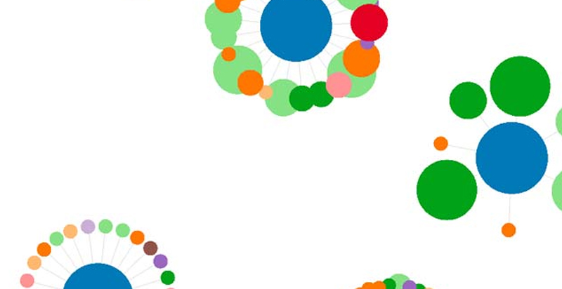
Often times, when we're looking at a mass of data, we're trying to get a sense for relationships within that data. Who is the leader in this social group? What is a common thread between different groups of people? Such relationships can be represented hundreds of ways graphically, but few are as powerful as the classic network diagram.
Read More »Recent Posts
Posts by Author
- AIBS BioScience Talks (1)
- Alanna Riederer (1)
- Austin Schwinn (2)
- Clive Higgins (3)
- Dave King (7)
- Derek Grape (2)
- Dr. Alicia Knoedler (2)
- Frank D. Evans (4)
- Jeff Johnston (1)
- Jill Macchiaverna (9)
- Josh Southerland (1)
- Ken Goulding (1)
- Luke Tucker (3)
- Matt Coatney (3)
- Matthew Schroyer (4)
- Mike Perez (10)
- Sandeep Sikka (1)
- Shannan Callies (2)
- Stephen Arra (1)
- Terri Gilbert (2)
- Tom Lambert (2)
Posts by Tag
- Innovation (19)
- collaboration (19)
- team building (17)
- Data Applications (15)
- Data Science (14)
- collaborate (13)
- new idea (13)
- Data Visualization (12)
- cognitive city (11)
- cognitive network (11)
- teambuilding (11)
- discovery (10)
- thought leadership (10)
- Exaptation (9)
- research (9)
- technology (8)
- Data Exploration (7)
- Platforms (7)
- Data + Creativity (6)
- Text Analysis (6)
- open data (6)
- software (6)
- tech (6)
- Big Data (5)
- Network Analysis (5)
- conference (5)
- ethnographics (5)
- human-computer interaction (5)
- innovation software (5)
- network diagrams (5)
- Communicating About Data (4)
- Dataflow Programming (4)
- Design (4)
- HCI (4)
- Platform (4)
- Rapid Application Development (4)
- artifact (4)
- co-production (4)
- innovation management software (4)
- startup (4)
- use case (4)
- women in tech (4)
- attribute (3)
- entrepreneurship (3)
- ethnographic (3)
- ethnography (3)
- Abstraction (2)
- Data-driven Decision Making (2)
- Machine Learning (2)
- PubMed® Explorer (2)
- User Interface (2)
- algorithm (2)
- entrepreneur (2)
- 3d Visualization (1)
- Financial (1)
- Netflix (1)
- building models (1)
- hackathon (1)
- hairballs (1)
- interdisciplinary (1)
- knowledge graph (1)


