
Since Exaptive launched in 2011, we’ve worked with many researchers, particularly in medicine and the natural sciences. PubMed®, a medical journal database, pops up repeatedly as a key tool for these researchers to develop hypotheses. It’s a tool built in a search-and-find paradigm with which we’re all familiar. Execute a keyword search. Get a list of results. Visualization can make search - and, therefore, research - much more meaningful.
Search Can Lead to More Than a List
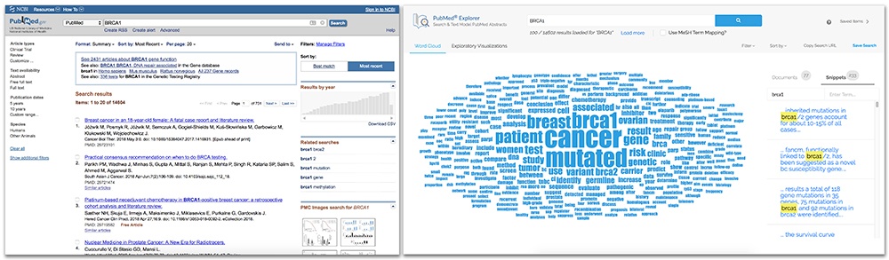
The ‘visualization’ at the end of the PubMed user-journey is a table of articles to read. Only after reading all the curated articles will the researcher know if another keyword shows up repeatedly across multiple papers. This could launch a new search, and lead to a new data visualization (that being another list of articles to read).

“Instead of building a visualization to answer a single question, we should build worlds that are explorable to answer any question,” said one of our data scientists Frank Evans at a TEDx talk at the University of Oklahoma. Frank said, “Let a user look around, browse with or without specific purpose, focus in on what catches their eye... I don’t want to stop at answering a question. I want to let them formulate new questions they may not have even known they were capable of asking.”
PubMed is one of those tools like Microsoft® Excel. If you can learn enough about how to use it properly, you can do astounding things with it. But they take time and familiarity to extract maximum value. At the time of writing this article, a search of “PubMed” on YouTube returns more than 50,000 videos, the vast majority explaining how to use PubMed.
One of the reasons Exaptive made the PubMed Explorer is to create that landscape in which scientists can wander and think, without having to use brute force to sift through results. We know that humans process information from images 60,000 times faster than they do from text. When a user interface leans on multiple data visualizations - other than or in addition to a list - to connect the user to other keywords, visual interaction lets the user explore results from different angles, without having to read every result or knowing exactly which keywords to search. In particular, word frequency and clustering algorithms create metadata about search results that can help the investigator find relevant results faster.
So Meta.
We hypothesize that this will be a particularly valuable tool for meta-analysis studies. Meta-analysis studies compile the results of many similar studies into one so there is a larger representation of a population. Those compilations are becoming more common. It’s not unusual to see in the Methods section of an article things like ‘electronic searches using specific search terms.’
A paper by A.B. Haidich in 2010 in the journal Hippokratia delved into the value and potential drawbacks of meta-analysis studies, “The benefits of meta-analysis include a consolidated and quantitative review of a large, and often complex ... body of literature... The need to integrate findings from many studies ensures that meta-analytic research is desirable and the large body of research now generated makes the conduct of this research feasible."
Faster Search is Different Search
Let’s go back to Frank’s idea of a data landscape that you can walk through. A scientist can use the PubMed Explorer to search journal article data in this new way. The researcher can search not only by their direct queries, but have a vantage point that includes relevant information nearby. The researcher has perspective to adjust the scope of their search in real time, before reading 200 pages of scientific journal articles.
So with better visualization, researchers won’t just create more hypotheses. They’ll be able to innovate in directions not yet visible from here. They’ll be able to preempt doing a new study if there is already a wealth of data in that area. They’ll be able to focus on creating studies for areas that are currently ambiguous. What does it mean for patent investigators and anyone who uses PubMed regularly? They’ll be able to make connections quickly that weren’t easily seen before.
Faster discovery, more discovery, different hypotheses. All because the data visualization is a landscape instead of a list.
We’ve been exploring ‘Faster Is Different’ as it applies to facilitating research and innovation in general. Get more context on our perspective here. And here are an additional article about using science to make innovation faster and different:
Comments