When communicating about your latest data science project, whether verbally or in writing, your audience often needs to know the takeaway right away, or you’ll lose their attention. This is especially the case if your audience includes colleagues, conference attendees, or readers from outside your field. In an earlier post on communicating data science, I dove into how the elements of story can hold your audience’s attention through a dense presentation. This post introduces (and applies) some tried and true approaches for introducing the end of your story at the beginning. You’ll capture the attention of those for whom your point is valuable and have their attention for your story, and the rest of the audience doesn’t matter.

Is your audience a captive audience? If not, start with the ending.
When communicating about data science, it’s easy to get a little lazy and just start from the beginning of the process, e.g. “We had terabytes of data about our customers,” and then proceed with the story of how you did something with it. The point of your story, though, is that you discovered something important that has implications. Start with that, and then explain how you got there.
This article, analyzing urban planning data, is a great example. After the title, What a Creative Neighborhood Looks Like, there is the following stand-alone sentence: “A new study shows that the areas where creative workers and scientists live and work look quite different.” I could almost shed a tear. I know exactly what the peice is about and whether I want to keep reading. I may not keep reading if it’s not the right fit, but without it I would have been even less likely to keep reading, and the author would have lost a potential fan.
Ever heard the law school myth about a dean of students warning a room full of incoming students, “Look to your left, look to your right. Next year one of you won’t be here”? Call me cynical, but this I believe. If you’re in a presentation, look to your left and look to your right and know that only one of you is there mentally. The other two are thinking about their own life – work life, home life, or maybe even Second Life. If your audience has a choice about whether to pay attention, which most do, then starting with the conclusion of your presentation is the easiest way to get the right people’s attention for the rest of the story.
What is the “ending”?
Choosing an apt ending, however, is easier said than done, because the right ending depends on the audience (see the first post in this series). The exciting conclusion to your data science story might be the implications of your work on a particular business question or social issue. It could be the algorithmic technique you developed for the type of data. Let the audience dictate your angle.
Another dimension to choosing the right ending for a particular audience is whether it should be concrete or conceptual. The urban planning article above went with a concrete conclusion, “A new study shows . . .” It could have gone more theoretical, e.g. “A new study raises questions about the relationship between population density and creativity.” Which would have hooked you more?
Choose a technique for organizing your story around the right ending.
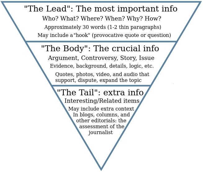
For starting with the concrete conclusion, the inverted pyramid is a model used widely in journalism that I find a fitting guide.

http://commons.wikimedia.org/wiki/File:Inverted_pyramid_in_comprehensive_form.jpg
The concrete facts come first and then one enriches the story with the theoretical. An abbreviated implementation using the urban planning article might be the following:
- Lead: A new study shows that creative districts are more densely populated than their scientific counterparts.
- Body: The data imply that density aids in creativity.
- Tail: It remains to be answered whether creatives seek density or simply exist in it for economic reasons.
To come from the theoretical first, one can borrow and riff on a legal writing technique known as IRAC, which stands for issue, rule, application, and conclusion. I suggest putting the conclusion at the beginning and maybe restating it at the end, so CIRA(C). Using the same urban planning example, employing CIRA(C) might look like this:
- Conclusion: A new study shows creative and scientific districts look very different in terms of their population and spatial density.
- Issue: Planners struggle with how to engender creative and scientific districts for their cities.
- Rule: Typically, creative districts develop organically in areas of high density.
- Application: That bears out in the study.
Get out of jail free with good data vis.
Well executed data vis charms us in a way that words rarely will. It can lead us by our own volition toward an unknown conclusion, without having to know it will be useful. Check out this interactive data vis in the New York Times about an esoteric but valuable economic index. I for one was immediately drawn in by a topic at which I would normally glaze over. It’s almost magical.
“Knowing is half the battle” – G.I. Joe.
The internet seems to agree that communication is an essential skill for a data scientist. Whether it’s “9 Must-Have Skills You Need to Become a Data Scientist,” the top 7, top 3, or the multitude of similarly titled posts, communication is on the list. Many managers out there, however, are skeptical, if not condescending, about data scientists’ ability to communicate effectively to anyone but each other.
Effective communication across disciplines and departments is like a cross-cultural exchange. It’s challenging but exciting to master, and if you do, I am only slightly exaggerating when I say that you will be beloved. Everyone appreciates a worthwhile presentation instead of “another meeting.”
In the next post, I’ll dig into the sometimes elusive balance between clarity, story, and attempts at drama when presenting data science

Comments