Fifteen years ago, I had the unique opportunity to go on Semester at Sea, an around-the-world trip on a converted cruise ship that combined college coursework stops at nine countries on four continents. This once in a lifetime trip instilled in me a strong sense of wanderlust and a deep desire to give back to the global community.
Every Journey Begins with a Single Step
Fast-forward to a few months ago, when I joined Exaptive on an exciting new project. A large NGO enlisted us to analyze a massive set of historical data for countries. The goal: to develop a better, more granular means of grouping countries than the outdated and crude approach of "developed" and "developing." This large, complex, messy dataset and thorny problem were a great fit for my background in artificial intelligence and data science.
My first task was to organize and clean up the raw metrics. Anyone who has done this before knows that data, like war or politics, always look a lot tidier when viewed from 30,000 feet than when you are in the trenches. I never blame the organization; this is simply reality. Countries have different names and abbreviations. They can go through peaceful mergers or bloody coups. Even something simple, like whether the data was collected by a US or EU agency, can wreak havoc on data processing.
I developed a series of Python scripts that collapsed metrics into their correct countries, handled missing or improperly formatted data, and "pivoted" the metrics, which originated as one file per metric, so that the resulting data set was organized by country with its constituent metrics. The result was a JSON file (quickly replacing XML as the gold standard for data exchange) that was ready for further processing.
Searching in the Wilderness
What happened next can best be described as a digital version of wanderlust. It seems the itch from my world travels also benefits my role as a data scientist. After preparing the data, I began exploring ways to compare and group time series data like this. I started my search in the audio space, looking at algorithms that analyze and classify music. This didn't seem to be a great fit, since audio signals tend to be much messier and periodic in nature. Audio processing algorithms likely would have been overkill.
I then stumbled upon an interesting algorithm, Symbolic Aggregate approXimation (SAX). (There is a later version of the algorithm called HOT SAX. Who says scientists can't have a sense of humor?) SAX converts time series into a sequence of letters, opening the door to standard data mining techniques that work with strings. Having worked with biological data and text earlier in my career, this struck a chord with me. I discussed with the team, and we decided to pursue this avenue.
In the spirit of rapid iteration, I quickly prototyped a web API for ingesting input and returning JSON results, integrated an open source library called JMotif that implements the SAX algorithm, and stood up an instance of the API on Amazon Web Services. This took about ten hours of work over the course of a week, which is both an impressive feat and a testament to how technology has advanced.
An Unexpected Turn
When we first reviewed the country metrics as SAX strings, we noticed the strings looked a lot like DNA sequences. Could a clustering algorithm be used on these strings, much the same way geneticists analyze and compare strands of DNA? We began discussing possible clustering algorithms and how to calculate the similarity of two countries.
To prove the concept, I then augmented the web API to use a basic clustering algorithm (K-Means Clustering) and string distance function (Levenshtein) to cluster the data. I then extended the concept by clustering individual metrics to create a vector “fingerprint” of each country. These could then be used to further cluster and analyze the countries.
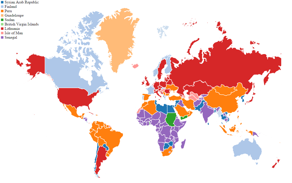
The results were astounding. After just one more week, I had developed this, integrated it into the Exaptive platform, and we had a working application that took in country data and rendered clusters in a map:

We immediately saw some interesting patterns, even with these preliminary results. (How cool is that?)
A Serendipitous Meeting of Two Strangers
Since we were thinking of the SAX strings like DNA, we asked a distinguished cell biologist to join the conversation. He noted that the strings looked more like protein sequences than DNA. I adapted the algorithms to use a 20-character alphabet like amino acids and added magnitude from our time series data to mimic gene expression (the amount of protein produced). We saw immediate improvement when adding these elements.
He then suggested we try the gold standard for protein alignment, the Clustal Omega algorithm. Reflect on that for a moment. We started with geopolitical time series data that felt a lot like audio signals or financial data, and we ended up talking to a scientist about protein sequence clustering. That is cognitive exaptation and digital wanderlust at its finest.
I updated the web-based API once more to convert the SAX strings to protein sequences and integrated the Clustal Omega algorithm. I also added statistics to the output, so we could assess the quality of clusters returned for different algorithms and other parameters.
Stumbling Upon an Unexpected Find
When we completed the analysis and studied the data, we found that the protein alignment performed a little worse than our earlier approach, suggesting that when events occurred plays an important role in grouping countries. We also found the ideal cluster size to proceed with further analysis.
I wanted to see if we were just picking up spurious correlations that had no real meaning or if we were on to something. I chose one of the metrics, malnutrition, to see if countries in a specific cluster showed similar levels and trends for malnutrition. The findings were astonishing. Separate clusters accurately captured those countries that had low and steady levels, moderate but significantly improved levels, and those where malnutrition is real problem. I was even able to correlate specific policy decisions like education, healthcare and infrastructure to malnutrition trends.
A Place to Rest for the Night
We presented our initial findings to the NGO, and they were visibly excited. We had some initial data to support their hypothesis that countries should be grouped not by geography or economic status, but by a deep, nuanced understanding of key metrics like literacy, GDP, CO2 emissions, infant mortality rates, and hundreds of other data points. And, we had delivered results in an insanely short time frame. We were excited too. We were able to make an immediate positive impact by giving back to the global community. And, we now have the tools to analyze all sorts of other time series data in a novel way. Who else can we help, and what other unintended exaptations await us? This is not the end, but a temporary place to rest before wandering again.
Coming Full Circle
In a very short time, we traveled (virtually, at least) across two continents and six cities in search of answers, engaged a team of four people in multiple time zones, and built a working solution that - we hope - will make an impact on how we talk about countries and tackle health and poverty issues.
It seems my wanderlust is alive and well after all. Great things can happen when you drop your preconceived notions and let the wind and road take you where they may.

A photo I took of school children from Khayelitsha Hopolang Primary School in South Africa

Comments