I like to build things. I like analysis. I like programming. Interestingly, you often need to reverse that order before you’re in a position to build an application for analyzing something. You need programming knowledge to turn the analysis into a “thing.” The problem is, while I like programming, I’m still new to it. I mean, I’m Codecademy good, but that doesn’t translate into a user facing application leveraging Python, Javascript, and D3. So, when I recently sat down to build a minimally viable data application for looking at airline stocks, I wondered how long it might take to get to viable and, frankly, feared how minimal it might be.
But, an hour later I had it. It wasn’t beautiful, and it wasn’t viable in the sense of providing valuable insights. It was, however, illustrative. It made it easy to ask, “does this layout make sense?” “Is this the data I actually want?” I could show it to a client, or my boss, and ask, “Is this the direction we want to go?” I could get feedback, fast. That was valuable.
How did I build something in less than an hour? I leveraged what was already built when I could, leaving me to write as little code as possible, preferably none. That’s my weakness in this whole building thing, if you’ll remember.
I started with a quick white boarding session. I had a general sense of what I needed. Dates, stock prices, stock information, visualizations, etc. I searched for components I might need, some I knew existed, some I didn’t. An example of a pleasant surprise came when searching for “date”, as I needed some way to input a date range, I found a “DatePicker” component. It was exactly what I needed and something that would’ve taken me all day to build.
The resulting mockup, built in the Xap Builder, looked like this:
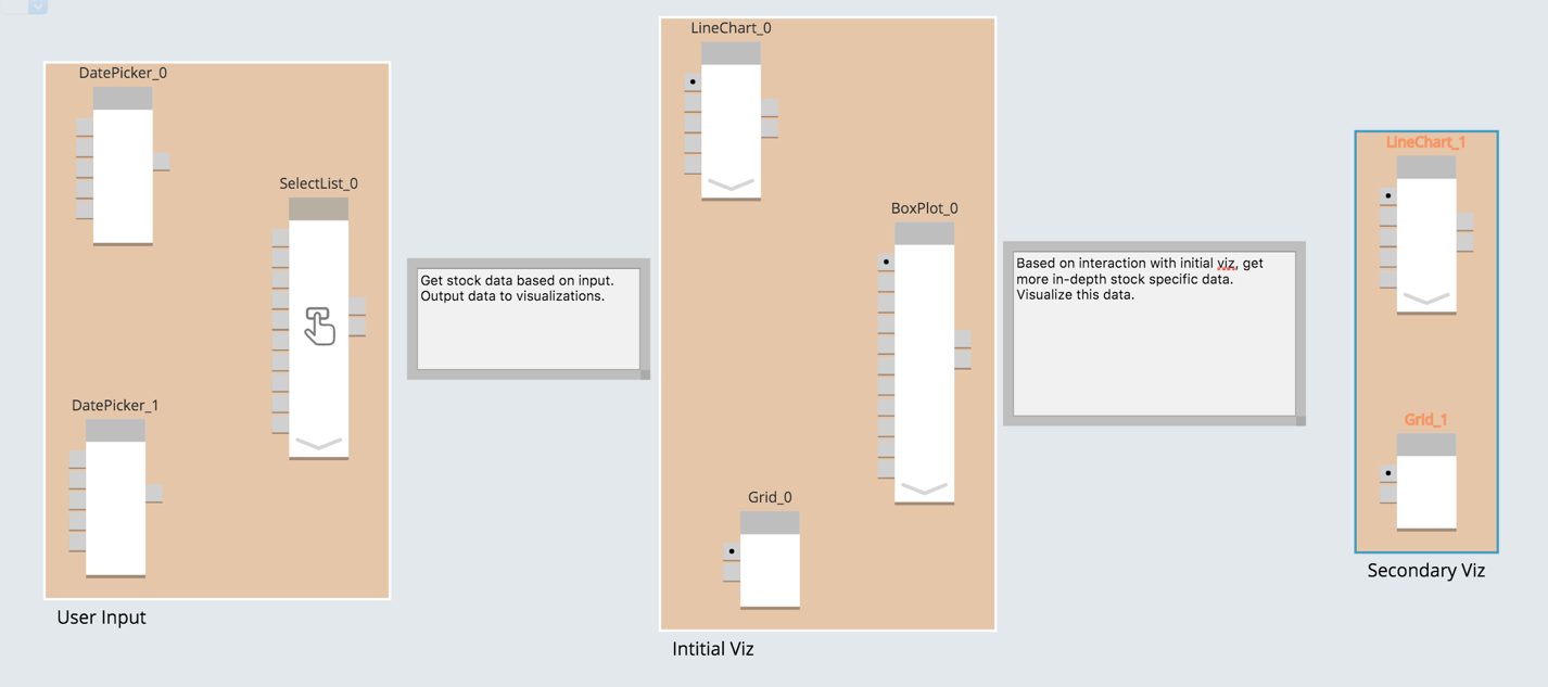
This only took a few minutes, but effectively illuminated what I had (the components), what I needed (the comments indicating necessary components), and the initial framework for my dashboard. In this case, it helped me see that the problem was mostly solved and that I was a capable enough programmer to fill the gaps. If there were gaps I couldn’t fill, I could have easily pulled in one of our more experienced programmers by sharing the whiteboard. But, in this case, I could handle it.
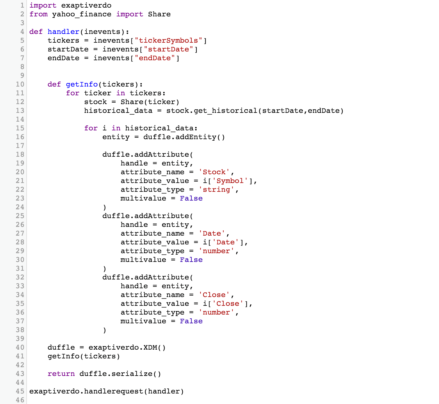
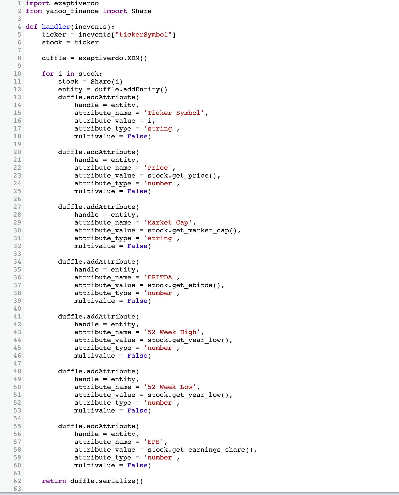
To fill the gaps, I needed components for getting financial data. A quick google search revealed the Yahoo Finance API as an easy and accessible solution. A Python library I found turned “easy and accessible” into 3 lines of code for getting the information I needed and less than 50 to get the information and iterate through it, creating a duffle of data for my initial visualization (price for a given date range and ticker symbol). In case you’re wondering what a duffle is, it’s an Exaptive specific data model, built to be powerfully simple. If you’re interested, learn more here. Back to Yahoo Finance, the story was similar for a component returning more granular data (Market Cap, EBITDA, EPS, etc. for a given ticker symbol). Less than 110 lines of straight-forward code later, I had what I needed.
Get historical data:
Get granular data:
All that was left was to wire things up and configure the visualizations.
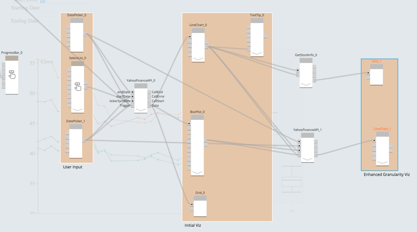
I added a progress bar component, because the API calls were a bit slow with larger date ranges, and a tool tip to the line chart to better see the stock where my mouse was hovering. The rest of the time was configuring components. (Oh, and hacking the CSS to get a layout using a copy and paste job from Stack Overflow.)
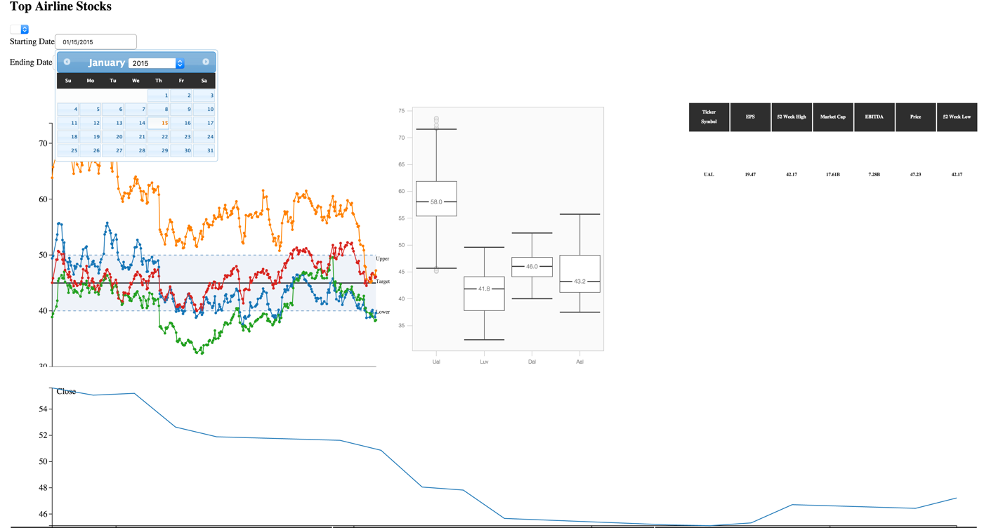
Input four airline stock tickers, a date range, and…voila! Two line charts, a box chart, and a table. In the upper plot, the orange line is United (Ual), the blue is American (Aal), the red is Delta (Dal), and green is Southwest (Luv).
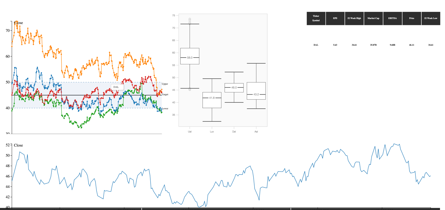
Below, I hover the line for Delta Airlines. (Notice the small tool tip with the ticker symbol where I’ve hovered). The table displays the data for Delta, and an updated line chart underneath shows only Delta’s stock over the given time period.
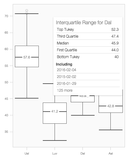
I can also hover over the box chart to get more detail.
Since it's a prototype, the first step in a process, I also included a sortable, scrollable table with all of the data, just beneath the dashboard. I might not include that in further iterations, but in early stages, I can use it to troubleshoot the data return.

The goal of this was an MVP dashboard, and I think I achieved that. Would I buy American Airlines stock based on some insight it provides? Not today. Do I have a better line of sight to a valuable data application? Absolutely. So what did I learn?
I need a better data source, offering more granular data, including ratios that provide insight into the state of these companies individually, as they relate to one another, and the airline industry as a whole. I could build components to massage the data I have into something more useful, but why reinvent the wheel? In fact, the first person I showed this to, said, “finance people use the Quandl API, the data is much better.” #fastfeedback The nice part? Thanks to an ethos of modularity, I can pull the Yahoo Finance components, replace them with Quandl API components, losing none of my current functionality in the process.
I learned I’m no CSS wizard (note the less than perfect layout), but we have a guy who is, so why spend too much time worrying about it? My goal wasn’t something beautiful. It was a compass pointing to next steps for a better application.
Finally, I learned that airline stocks haven’t outperformed over the past year, despite a constant slide in fuel prices. In fact, on the whole, you might characterize them as underperforming with a sprinkle of volatility. Does it mean fuel price doesn’t impact their profitability, and therefore their value? It can’t. Does that mean these stocks are currently undervalued? It could and a next version of the dashboard might help decide.
Why was I able to do this in less than an hour? Because other people have solved their problems by building components that turned out to be a big part of the solution to my problem.
But it’s satisfying to note that no one else will have to build a component for getting stock prices. I did the work (all 45 lines worth) and it’s now available for use by anyone solving a problem using the same set of data. I leveraged the system where I could. I made a contribution where I could. The result was a prototype data application in 45 minutes.

Comments