
In the early 1990s, Burger King began an ad campaign that had a massive impact on consumers, especially in the United States. Anytime I hear the words, “Your way, right away,” I immediately hear the jingle that went along with it. The promise that you could have anything you wished -- and have it immediately -- was adopted in many sectors and pushed as good customer service, whether you’re in Human Resources and your customer is an employee, or you’re in Client Support and your customer is the client.
“Right away” hampers good development, interactions, and business relationships because doing good work can take time. Leaders (CEOs, COOs, CIOs, and others) often only have a few minutes to explain their work from a team of 50 or more people. That’s 26,000+ hours of work in a quarter, that the bottom line is being affected by. What if there were other metrics that could visually show a deeper story?
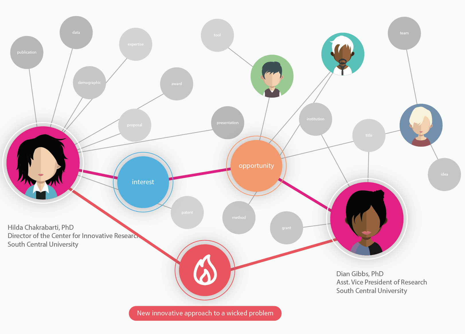
The concept of Exaptive’s Cognitive City innovation platform is one that can be overwhelming and a little hard to imagine. I spoke with our Product Owner Tom Lambert about a real interaction and exercise he did with a potential client. I realized it was a great chance to show our story.
Building Schema to Tell a Story
Every organization has facilitators, people who translate between departments and stand in the gap with relationships and project management skills to push work and the vision of the organization forward. Often, they have some kind of CRM (Customer Relationship Management) software, even if it is as simple as an Excel spreadsheet. They use it to keep people connected, organized, and on track.
The problem with this role is that it is really tough to scale. The information facilitators hold speaks directly to that individual who stands between organizational data and their own creativity while the visualization of the information is in their mind and can’t be scaled. The question the Exaptive team is working to solve is: what if this data could be alive and visualized in a way that makes facilitators and translators 10 times more effective? What if that could help them train others within their organization to use the available data in the most effective and efficient way?
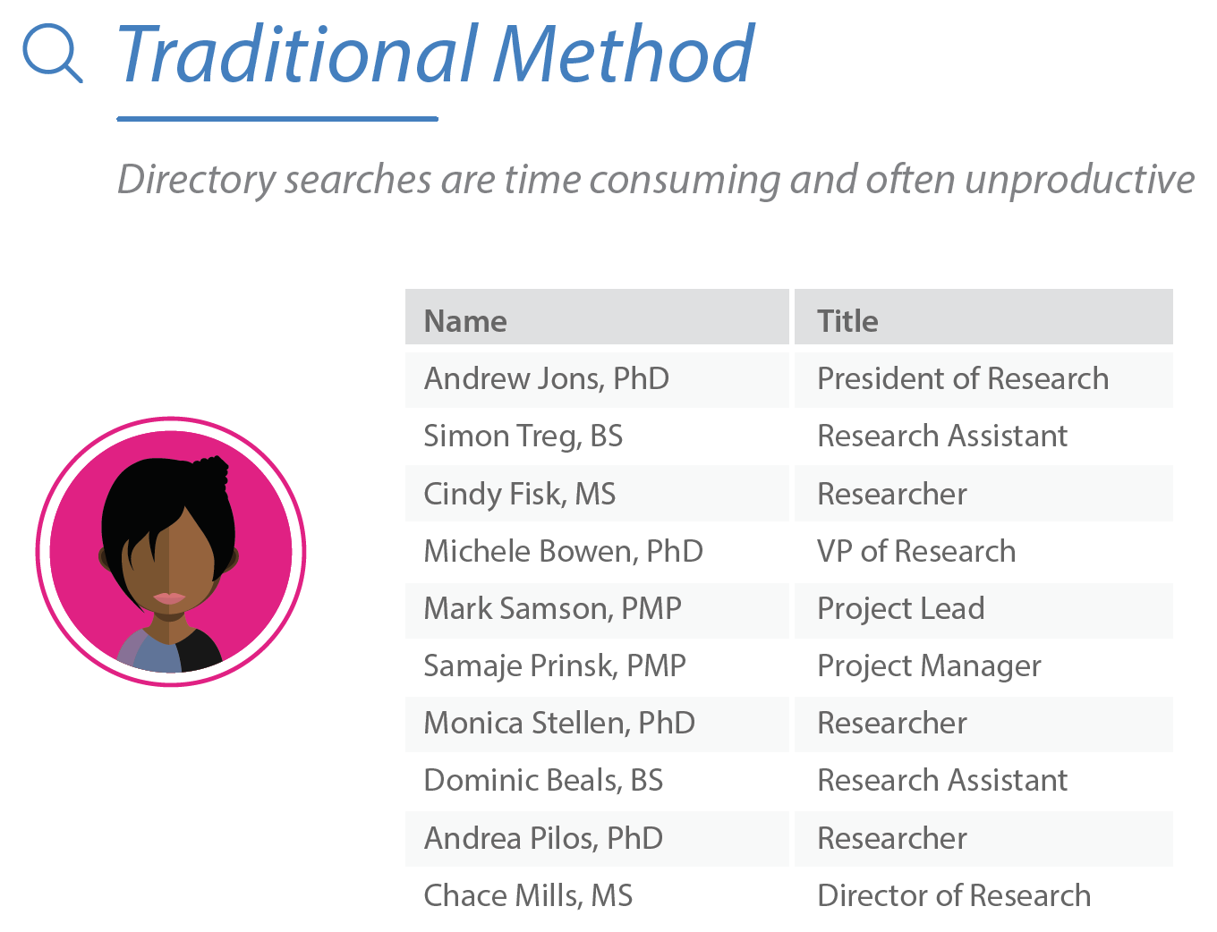
Generally, we organize our data into rows and columns and multiple tabs in a spreadsheet. Tabular data gets overwhelming quickly, and doesn’t represent relationships the way network diagrams can. If you want to connect people to resources in a meaningful way, it helps to look at the data a little differently. Some people (usually they have titles like project managers, facilitators, or translators) are amazing at standing in the middle of projects or even organizations and making these connections possible. They know just how to keep work moving forward and in an efficient manner.
What happens when they leave the room? Will everything fall apart if those people can’t be engaged with every interaction? How do you share them when they are needed in many places at once? We need their imagination and explanations to anchor a team, a project, an organization. We need a way to capture the successful mental models they’ve created in a way that other people can understand and learn from knowledge typically locked in someone’s head.
Let’s go a step up from spreadsheets and talk about data visualization. Most people are familiar with these as pie charts or bar graphs. The charts created can be hard to work with because they are static. It is so much better to work in an innovation platform that:
- is alive.
- retains data, connections, projects, partnerships.
- can visually help create efficiency.
- has tools for data visualization.
- keeps teams connected and collaborating no matter where they are geographically.
Getting Started
We start with a diagram of the data you have. We call the diagram above a schema. You know your community and the people or actors inside, their attributes (location, age, degree, specialty, etc). You know the projects they are working on and everything about them. We call projects and other things created by humans artifacts (some examples: grants awarded, papers published, projects completed, initiatives worked on, clients won).
In this example, Tom had several meetings with the leadership of the small non-profit Rural Aspirations, which works to support innovation in education in rural Maine. The project in focus was the Maine Forest Collaborative, which would connect teachers with experts to supplement or participate in rural student curriculum. “Both my colleague and I are really action-oriented people. We see a need and jump in to do things,” says Val Peacock, education consultant and co-organizer of the Maine Forest Collaborative. “So when we first started doing this work, I don't think we really understood all about ... the different sort of capacities and skill sets [involved]. One of the things that came from working with Exaptive for me was [the realization that] what we're actually doing is building a network around students.”
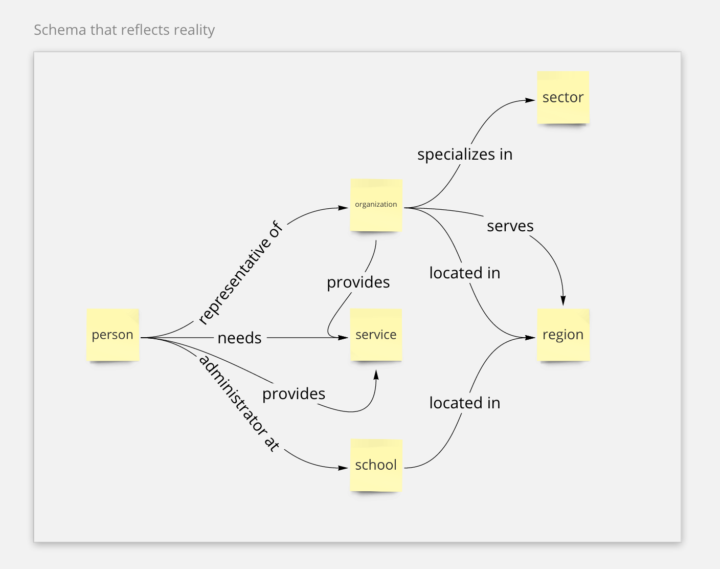
Tom took what he learned about the problems they were trying to solve and turned it into a linear dataflow (the above image). The goal was to not only visualize what data they had; it was to help them work toward getting better at finding holes, using data to illuminate gaps in planning or areas of focus they needed to consider to achieve future goals. Already we can see the story of this organization in the schema above.
While showing the organization their Visual City based on the schema with yellow boxes, they started asking questions about how the queries are structured. Their Visual City looks something like this right now:
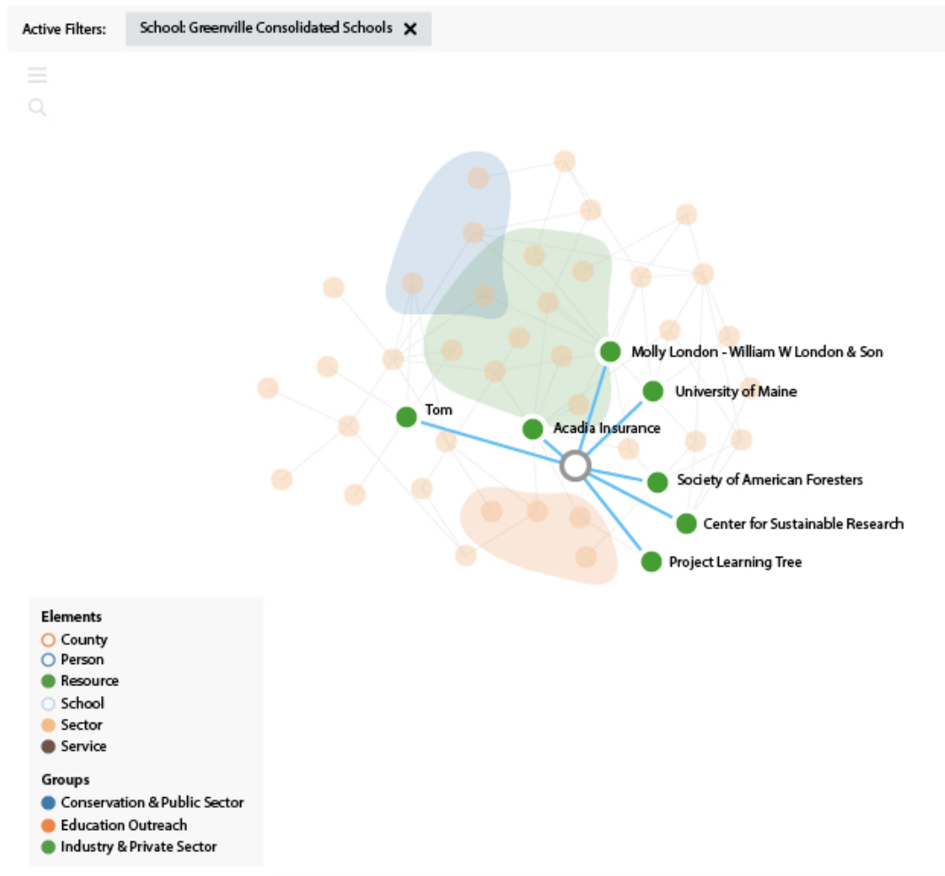
Full disclosure: it took some work to get to this view. The first view of the group’s network diagram looked like a hairball because there was so much internal connectivity. “The network map wasn't necessarily as clean as the schema, so we went through multiple iterations of trying to clean [the network view] up and make it usable for a teacher or a user. ... It feels better now than when we first started, but the schema itself was the thing I think that helped us to clarify: ‘what are we actually trying to connect’ and ‘what are we trying to look at’ and ‘what do those edges mean.’”
Tom showed them the schema to help them understand how the data reflects their real-world understanding of the network they’re trying to map and grow. He then explained to them how Exaptive’s interpretation of the underlying problem they’re eventually trying to solve is the development of solid models for how private sector, public sector, academic sector, schools, and communities can work together to transform education systems so that teachers have easy access to all kinds of resources for students.
Data visualizations can represent what has been accomplished, but they can also hold goals and aspirations for future work. During Tom’s information gathering, he was able to identify data needed for this organization’s future. He added blue boxes which represented his understanding of the concepts that the organization would like to be collecting data for.
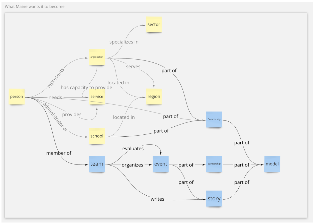
He took a chance in showing them this information and it was clear that it resonated with them in very real terms. They talked more about the data the organization don’t have yet, and how to create a system for getting that data through various mechanisms. Some ideas included apps that help teachers find experts who can present in classrooms and apps that let students evaluate projects and write stories about their experience so that when they want to create models to reproduce in other communities they have everything at their fingertips.
Creating the Living Network
This discussion process advanced the organization’s resource map into a living network. They began to see how to get from what they have now -- a loose-knit and serendipitously innovative community -- to what they want: a highly-functioning community where multiple sectors are focused on the common goal of helping students learn and be proud of their communities.
Within a few hours, they came back with their own representation of that network and what they envision it looking like (diagram below). Val notes, there’s a “real tension between talking about the work and doing the work. Sometimes we live in this abstract world of talking about what we're doing and how we need to do it and really getting into the depths of the systems that were trying to build. … [That’s] not engaging to a lot of people. Some people are really sort of intimidated by that and not interested and it's not helpful [for them] and so there's this other part where to do the work, we need to simplify and clarify and bring it down to a usable” level for people in the network. Adding concrete action items to their schema helped reduce the tension between thinking about the work and doing the work.
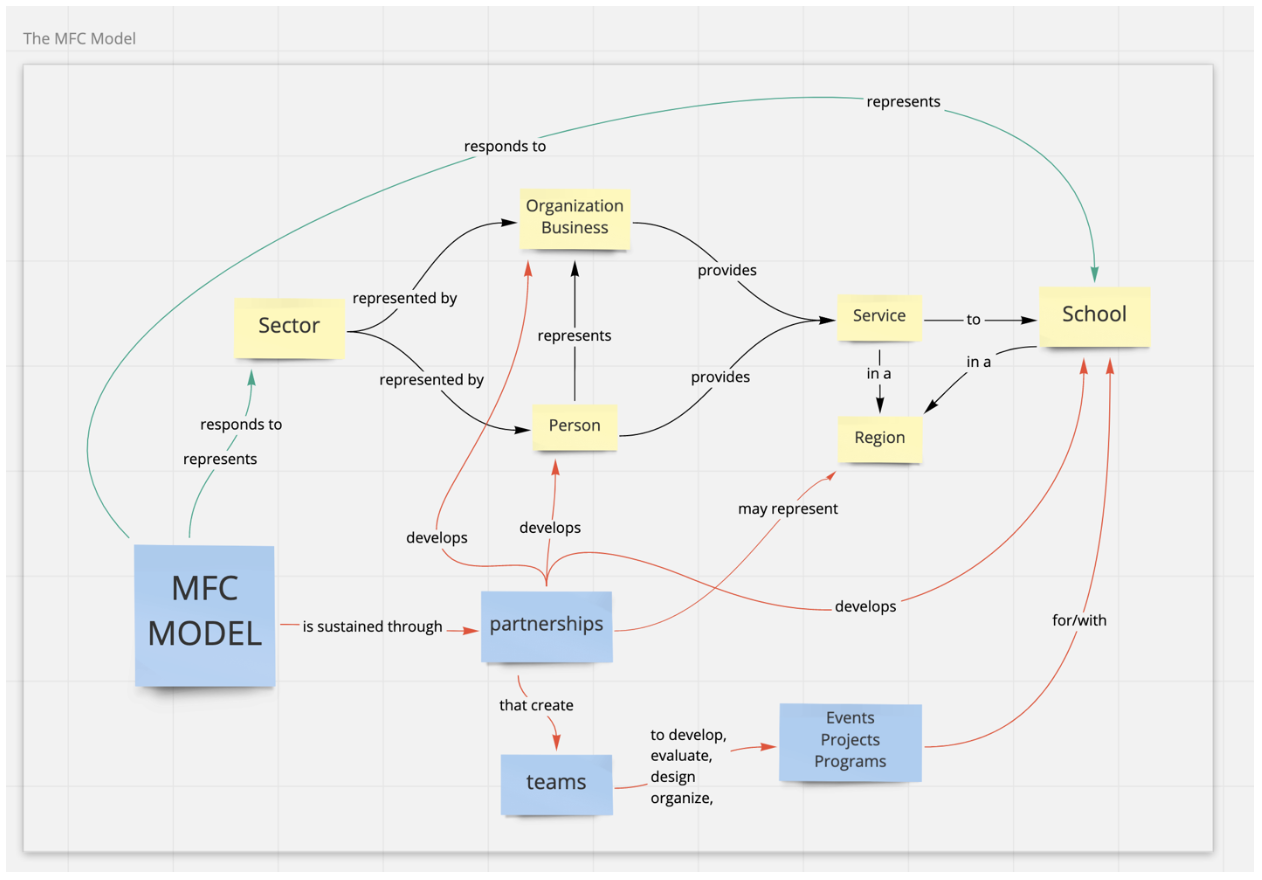
The interesting thing here is that we’re now conversing in database schema with a customer in a way that couldn’t happen before. The ability to create graph database schema that represents the customer’s understanding of the real-world network is helping identify the critical information that’s missing. More importantly, once a partner like Exaptive knows the customer’s story, we can understand which tools are most important to build first. We can provide an innovation platform that captures the real world behaviors playing out every day in the organization’s network so they can identify and measure those behaviors. When they have a clear understanding of which behaviors give them the outcomes they’re looking for, they can reproduce them.
What are the patterns you’re trying to reproduce in your organization? We can talk through your data, goals, and team dynamics and help you develop a simple schema that shows your story. If you want to take a stab at it on your own first, download a free template by clicking on the image below.
Comments