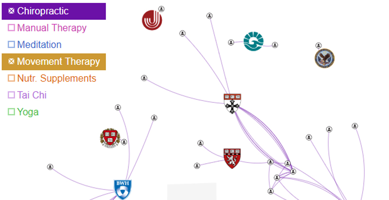
If your job is to get your company, team, or community to innovate, you know how organizational forces can make it hard to even try something new. Visualizing the resources available is an effective first step in overcoming some of those organizational forces. Simply being able to see, and show, what you have allows you to make a compelling case for marshaling resources and even spark some initial interactions in that direction.
Read More »Blog
If every ‘new’ idea is derivative, derive them.
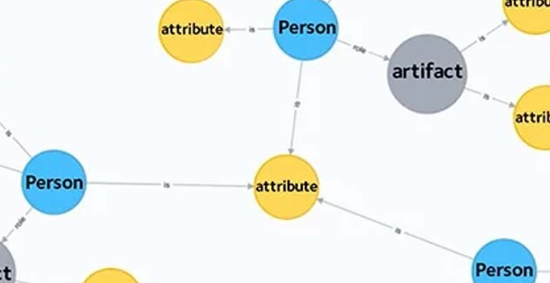
Everything is derivative. Take advantage of that. “New” ideas are the next step in an extensive network of existing people and ideas. If we can get the data and reconstruct the network, we can analyze it and understand where branches of a network have the potential for innovation.
Read More »Using Science to Build a Dynamic Collaboration Engine
“Good ideas are getting harder to find,” Exaptive CEO Dave King quotes from a recent paper by MIT and Stanford researchers. He points to the skyrocketing number of researchers employed in the U.S. and contrasts it with the inverse slope on a chart monitoring efficiency of researchers along the same timeline. “Those growing number of researchers are failing to produce value that outpaces what we’re spending to innovate.”
Read More »How Data Visualization Supports the Formation of Better Hypotheses
Since Exaptive launched in 2011, we’ve worked with many researchers, particularly in medicine and the natural sciences. PubMed®, a medical journal database, pops up repeatedly as a key tool for these researchers to develop hypotheses. It’s a tool built in a search-and-find paradigm with which we’re all familiar. Execute a keyword search. Get a list of results. Visualization can make search - and, therefore, research - much more meaningful.
Read More »Modern Research: Faster Is Different
Faster is different. It sounds strange at first because we expect faster to be better. We expect faster to be more. If we can analyze data faster, we can analyze more data. If we can network faster, we can network with more people. Faster is more, which is better, but more is different.
Read More »Machine Learning Helps Humans Perform Text Analysis
The rise of Big Data created the need for data applications to be able to consume data residing in disparate databases, of wildly differing schema. The traditional approach to performing analytics on this sort of data has been to warehouse it; to move all the data into one place under a common schema so it can be analyzed.
Read More »Owning the full-stack: A homesteading analogy on software, innovation, and freedom
Have you ever met a homesteader who owns a mansion? Me either. My neighbor, Bill (80), is a homesteader who tries to be as self sufficient as possible. From what I can see, it’s an immensely rewarding and humble existence. Life-satisfaction oozes out of his every pore and, eventually, even enduring the hardships must have become rewarding to him.
Read More »Optimizing a Team for Innovation or The Origins of the Sticky Note Exercise
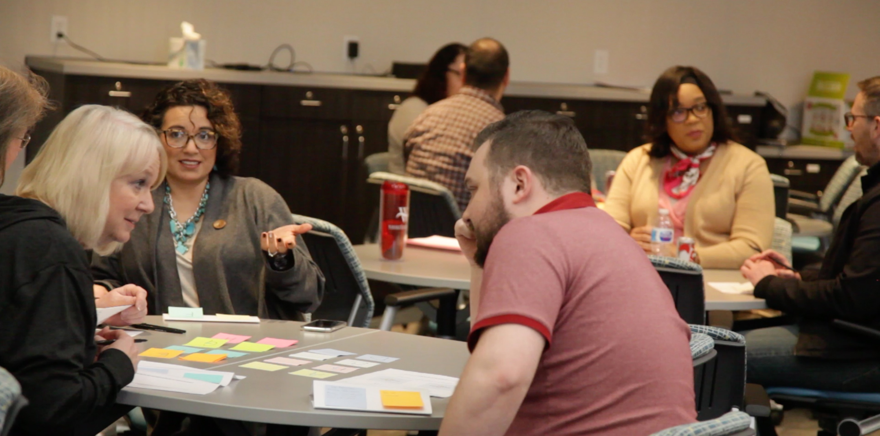
So many fantastic quotes are attributed to Albert Einstein. If you hear our CEO Dave King speak, he may bring up his favorite: “Combinatory play seems to be the essential feature in productive thought.” To have an aha moment, we have to play with a challenge from a variety of perspectives. We have to build collaborative teams to tackle complex problems.
Read More »Moving Beyond Data Visualization to Data Applications
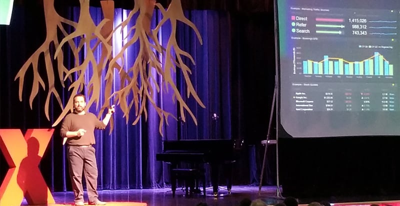
One thing we love doing at Exaptive – aside from creating tools that facilitate innovation – is hiring intelligent, creative, and compassionate people to fill our ranks. Frank Evans is one of our data scientists. He was invited to present at the TEDxOU event on January 26, 2018.
Read More »Exploring Tech Stocks: A Data Application Versus Data Visualization
A crucial aspect that sets a data application apart from an ordinary visualization is interactivity. In an application, visualizations can interact with each other. For example, clicking on a point in a scatterplot may send corresponding data to a table. In an application, visualizations are also enhanced with simple filtering tools, e.g. selections in a list can update results shown a heat map.
Read More »Recent Posts
Posts by Author
- AIBS BioScience Talks (1)
- Alanna Riederer (1)
- Austin Schwinn (2)
- Clive Higgins (3)
- Dave King (7)
- Derek Grape (2)
- Dr. Alicia Knoedler (2)
- Frank D. Evans (4)
- Jeff Johnston (1)
- Jill Macchiaverna (9)
- Josh Southerland (1)
- Ken Goulding (1)
- Luke Tucker (3)
- Matt Coatney (3)
- Matthew Schroyer (4)
- Mike Perez (10)
- Sandeep Sikka (1)
- Shannan Callies (2)
- Stephen Arra (1)
- Terri Gilbert (2)
- Tom Lambert (2)
Posts by Tag
- Innovation (19)
- collaboration (19)
- team building (17)
- Data Applications (15)
- Data Science (14)
- collaborate (13)
- new idea (13)
- Data Visualization (12)
- cognitive city (11)
- cognitive network (11)
- teambuilding (11)
- discovery (10)
- thought leadership (10)
- Exaptation (9)
- research (9)
- technology (8)
- Data Exploration (7)
- Platforms (7)
- Data + Creativity (6)
- Text Analysis (6)
- open data (6)
- software (6)
- tech (6)
- Big Data (5)
- Network Analysis (5)
- conference (5)
- ethnographics (5)
- human-computer interaction (5)
- innovation software (5)
- network diagrams (5)
- Communicating About Data (4)
- Dataflow Programming (4)
- Design (4)
- HCI (4)
- Platform (4)
- Rapid Application Development (4)
- artifact (4)
- co-production (4)
- innovation management software (4)
- startup (4)
- use case (4)
- women in tech (4)
- attribute (3)
- entrepreneurship (3)
- ethnographic (3)
- ethnography (3)
- Abstraction (2)
- Data-driven Decision Making (2)
- Machine Learning (2)
- PubMed® Explorer (2)
- User Interface (2)
- algorithm (2)
- entrepreneur (2)
- 3d Visualization (1)
- Financial (1)
- Netflix (1)
- building models (1)
- hackathon (1)
- hairballs (1)
- interdisciplinary (1)
- knowledge graph (1)
