I like to build things. I like analysis. I like programming. Interestingly, you often need to reverse that order before you’re in a position to build an application for analyzing something. You need programming knowledge to turn the analysis into a “thing.” The problem is, while I like programming, I’m still new to it. I mean, I’m Codecademy good, but that doesn’t translate into a user facing application leveraging Python, Javascript, and D3. So, when I recently sat down to build a minimally viable data application for looking at airline stocks, I wondered how long it might take to get to viable and, frankly, feared how minimal it might be.
Read More »Blog
How a Data Scientist Built a Web-Based Data Application
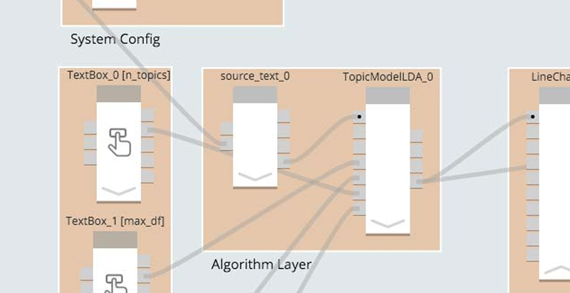
I’m an algorithms guy. I love exploring data sets, building cool models, and finding interesting patterns that are hidden in that data. Once I have a model, then of course I want a great interactive, visual way to communicate it to anyone that will listen. When it comes to interactive visuals there is nothing better than JavaScript’s D3. It’s smooth and beautiful.
Read More »Topic Modeling the State of the Union: TV and Partisanship
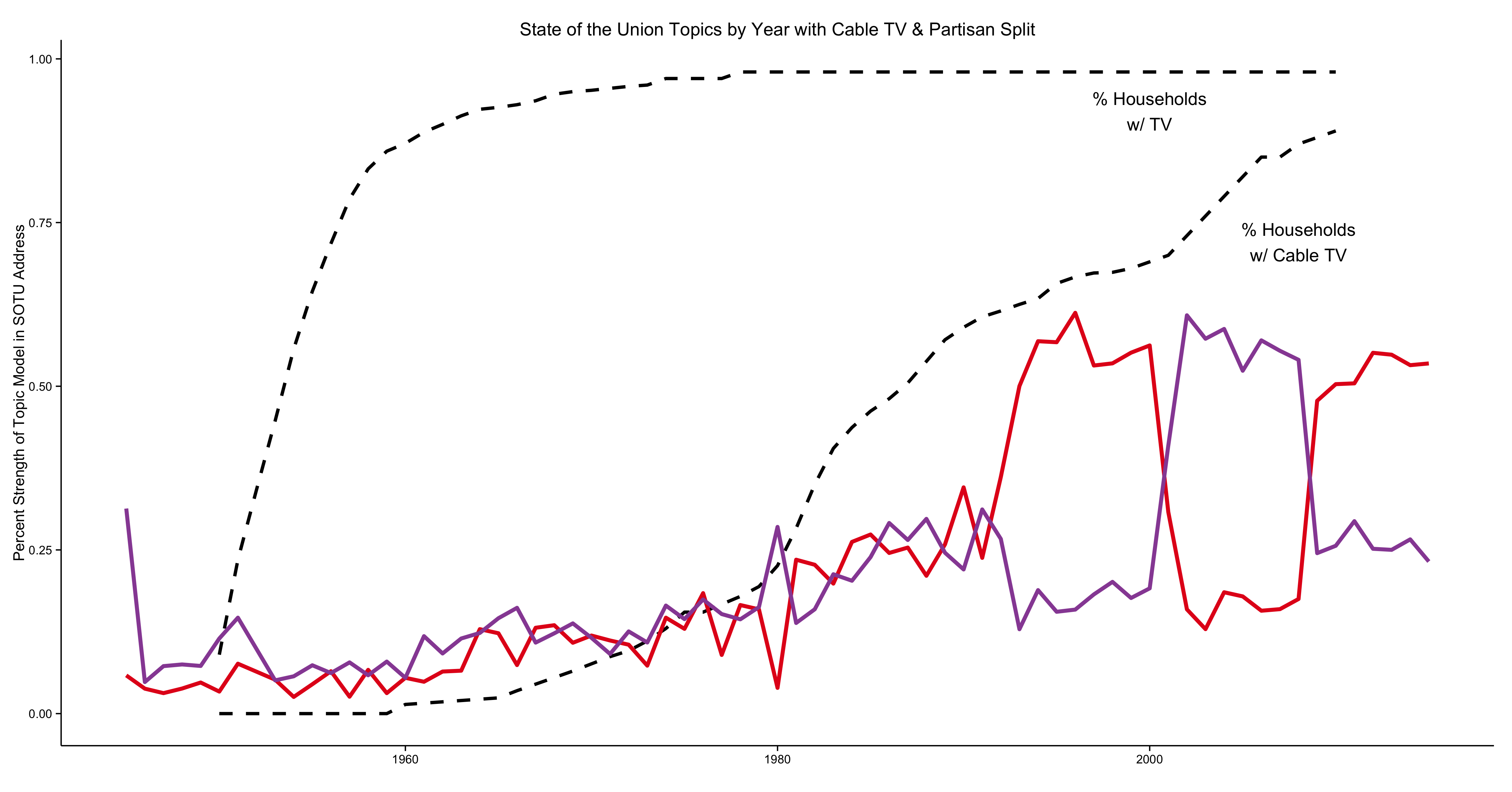
Do you feel like partisanship is running amok? It’s not your imagination. As an example, the modern State of the Union has become hyperpartisan, and topic modeling quantifies that effect.
Read More »Affecting Change Using Social Influence Mapping
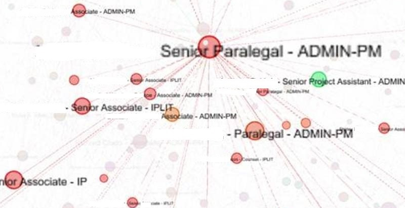
If you've ever tried to get a company to adopt new software you know how challenging it can be. Despite what seem to you like obvious benefits and your relentless communication, people selectively ignore or, worse, revolt against the change. Change efforts will even stumble in the face of this wisdom of the ages:
Read More »Text Analysis with R: Does POTUS Write the State of the Union or Vice Versa?
In this post, I apply text clustering techniques – hierarchical clustering, K-Means, and Principal Components Analysis – to every presidential state of the union address from Truman to Obama. I used R for the setup, the clustering, and the data vis.
Read More »Communicating Data Science: How to Captivate a Noncaptive Audience
When communicating about your latest data science project, whether verbally or in writing, your audience often needs to know the takeaway right away, or you’ll lose their attention. This is especially the case if your audience includes colleagues, conference attendees, or readers from outside your field. In an earlier post on communicating data science, I dove into how the elements of story can hold your audience’s attention through a dense presentation. This post introduces (and applies) some tried and true approaches for introducing the end of your story at the beginning. You’ll capture the attention of those for whom your point is valuable and have their attention for your story, and the rest of the audience doesn’t matter.
Read More »Data Science Wanderlust: Analyzing Global Health with Protein Sequences
Fifteen years ago, I had the unique opportunity to go on Semester at Sea, an around-the-world trip on a converted cruise ship that combined college coursework stops at nine countries on four continents. This once in a lifetime trip instilled in me a strong sense of wanderlust and a deep desire to give back to the global community.
Read More »Communicating Data Science with 'Story'
Getting your audience’s attention, keeping it, and persuading listeners of your point are all hard to do in a world where most listeners start out thinking, and feeling, “I’ve got my own scheisse to do.” John Weathington’s recent post in Tech Republic, “Be the Hemingway of Data Science Storytelling,” makes the point that presenting data, which can be dry, is more effective if it incorporates elements of story – a protagonist, a journey with challenges, and a conclusion. Jeff Leek’s “The Elements of Data Analytic Style” has a chapter about presenting data that emphasizes story as the method for communicating results.
Read More »The True Meaning of Catalyst, Crescendo, and Adaptation
People sometimes ask me what our company’s name means and why we chose it. The explanation often leads to discussions about similar but different terms. So I thought I’d use this blog post to explain, hopefully illuminate and while I’m at it, to correct some usage that’s bugged me for some time. Actually, let’s start right there.
I'm not sure where accuracy becomes pedantry, but there are two words - catalyst and crescendo - that instantly make my ears prick up when I hear them, only because I've heard them used incorrectly for long. One is from science and one from music, two things I tend to obsess about.
Read More »Embracing the Hairball
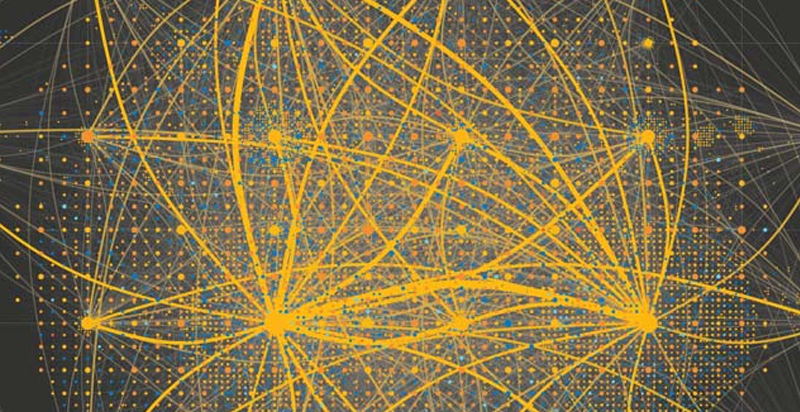
One of the perennial challenges in visualizing complex networks is dealing with hairballs: how do you draw a network that is so large and densely interconnected that any full rendering of it tends to turn into an inscrutable mess? There are various approaches to addressing this problem: BioFabric, Hive Plots, and many others. Most involve very different visual abstractions for the network.
Recent Posts
Posts by Author
- AIBS BioScience Talks (1)
- Alanna Riederer (1)
- Austin Schwinn (2)
- Clive Higgins (3)
- Dave King (7)
- Derek Grape (2)
- Dr. Alicia Knoedler (2)
- Frank D. Evans (4)
- Jeff Johnston (1)
- Jill Macchiaverna (9)
- Josh Southerland (1)
- Ken Goulding (1)
- Luke Tucker (3)
- Matt Coatney (3)
- Matthew Schroyer (4)
- Mike Perez (10)
- Sandeep Sikka (1)
- Shannan Callies (2)
- Stephen Arra (1)
- Terri Gilbert (2)
- Tom Lambert (2)
Posts by Tag
- Innovation (19)
- collaboration (19)
- team building (17)
- Data Applications (15)
- Data Science (14)
- collaborate (13)
- new idea (13)
- Data Visualization (12)
- cognitive city (11)
- cognitive network (11)
- teambuilding (11)
- discovery (10)
- thought leadership (10)
- Exaptation (9)
- research (9)
- technology (8)
- Data Exploration (7)
- Platforms (7)
- Data + Creativity (6)
- Text Analysis (6)
- open data (6)
- software (6)
- tech (6)
- Big Data (5)
- Network Analysis (5)
- conference (5)
- ethnographics (5)
- human-computer interaction (5)
- innovation software (5)
- network diagrams (5)
- Communicating About Data (4)
- Dataflow Programming (4)
- Design (4)
- HCI (4)
- Platform (4)
- Rapid Application Development (4)
- artifact (4)
- co-production (4)
- innovation management software (4)
- startup (4)
- use case (4)
- women in tech (4)
- attribute (3)
- entrepreneurship (3)
- ethnographic (3)
- ethnography (3)
- Abstraction (2)
- Data-driven Decision Making (2)
- Machine Learning (2)
- PubMed® Explorer (2)
- User Interface (2)
- algorithm (2)
- entrepreneur (2)
- 3d Visualization (1)
- Financial (1)
- Netflix (1)
- building models (1)
- hackathon (1)
- hairballs (1)
- interdisciplinary (1)
- knowledge graph (1)

